A spacial multiplayer operating system for creative work
Recently, I had the incredible opportunity to conceive and design a collaborative, infinite canvas-based operating system. This project took advantage of my strengths as a deep systems thinker, and gave me the chance to craft everything from the product architecture to the micro interactions and visual design aesthetic. I was very fortunate to be able to lead the product from its earliest conceptual phase, navigating ambiguity and distilling its core concepts to guide the team with clarity and vision.
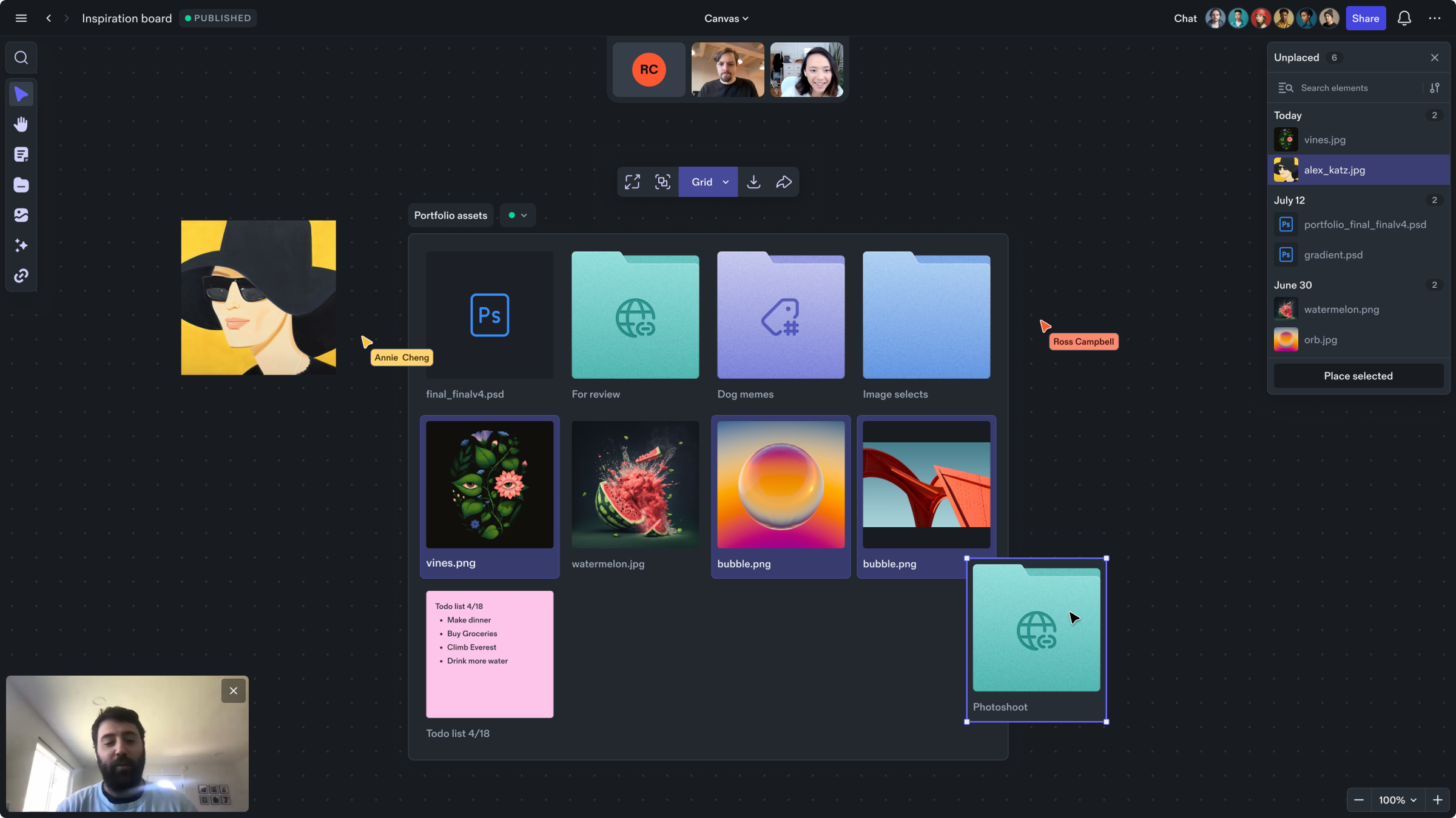
The building blocks of Studio
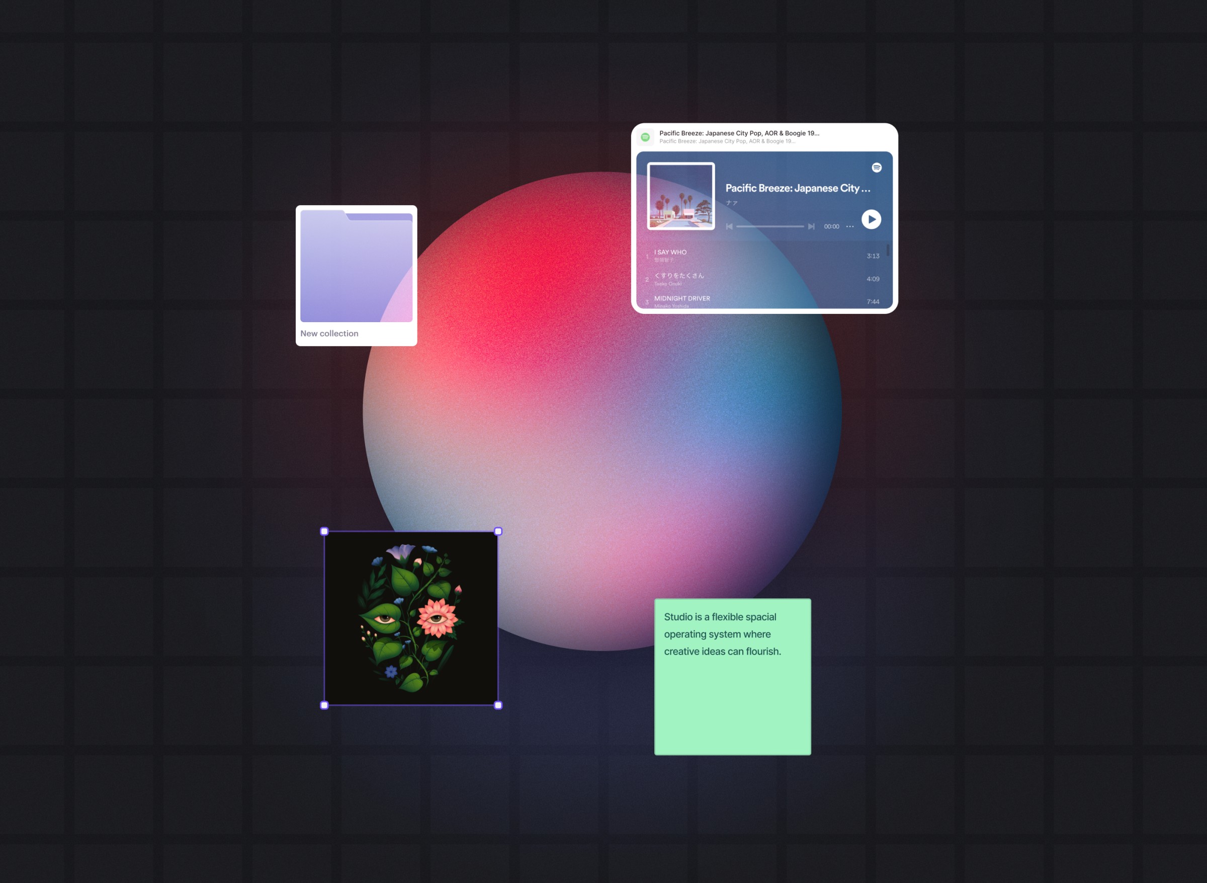
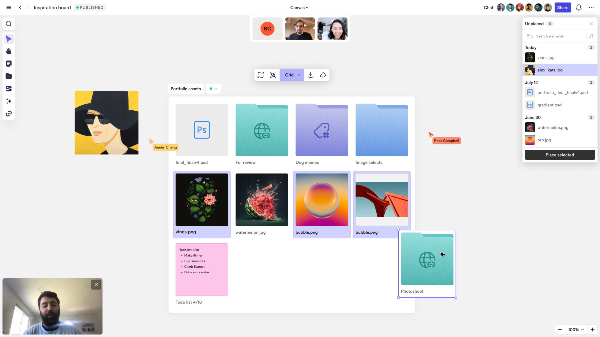
The studio system architecture is made up of a few powerful building blocks each with their own views. All of the artifacts below can be displayed as icon, inline, or fullscreen view. Additionally, container based artifacts like folders and collections, can be display in canvas, grid or list view.
• Folder - a container used to manually group and organize content.
• Collection - a container used to automatically group or organize content based on a set of rules.
• Element - a piece of content. Elements can be displayed in icon, inline, and fullscreen view.
• Instance - a reference to an element, folder, or collection.
• Flow - a directional presentation block that can contain elements or instances.
• Input - a block used to import or display external content within Studio.
• Output - a block used to export content from studio to the web or other services.
Sharing files from studio
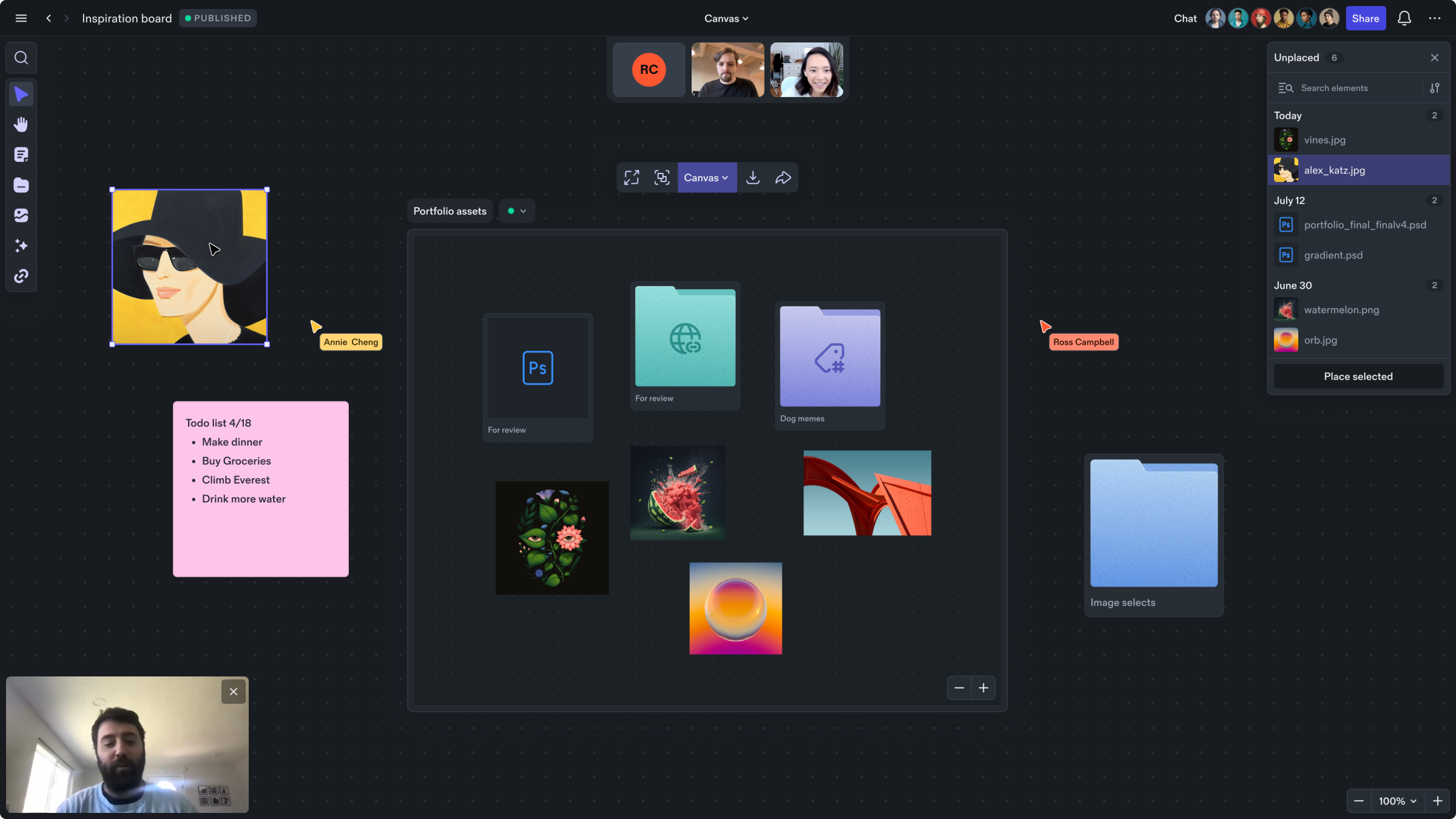
Select one or more files and then click share from the context menu. A link will be copied to your clipboard which can then be shared.
Shared content is displayed in a small microsite which can be viewed in a browser or by creating a site object directly on the canvas.
To do this, select “Create site from link” from the alert or just paste the link into Studio. A rich preview of the shared content will be added to the canvas which provides an easy drop location to add other files to that shared site.
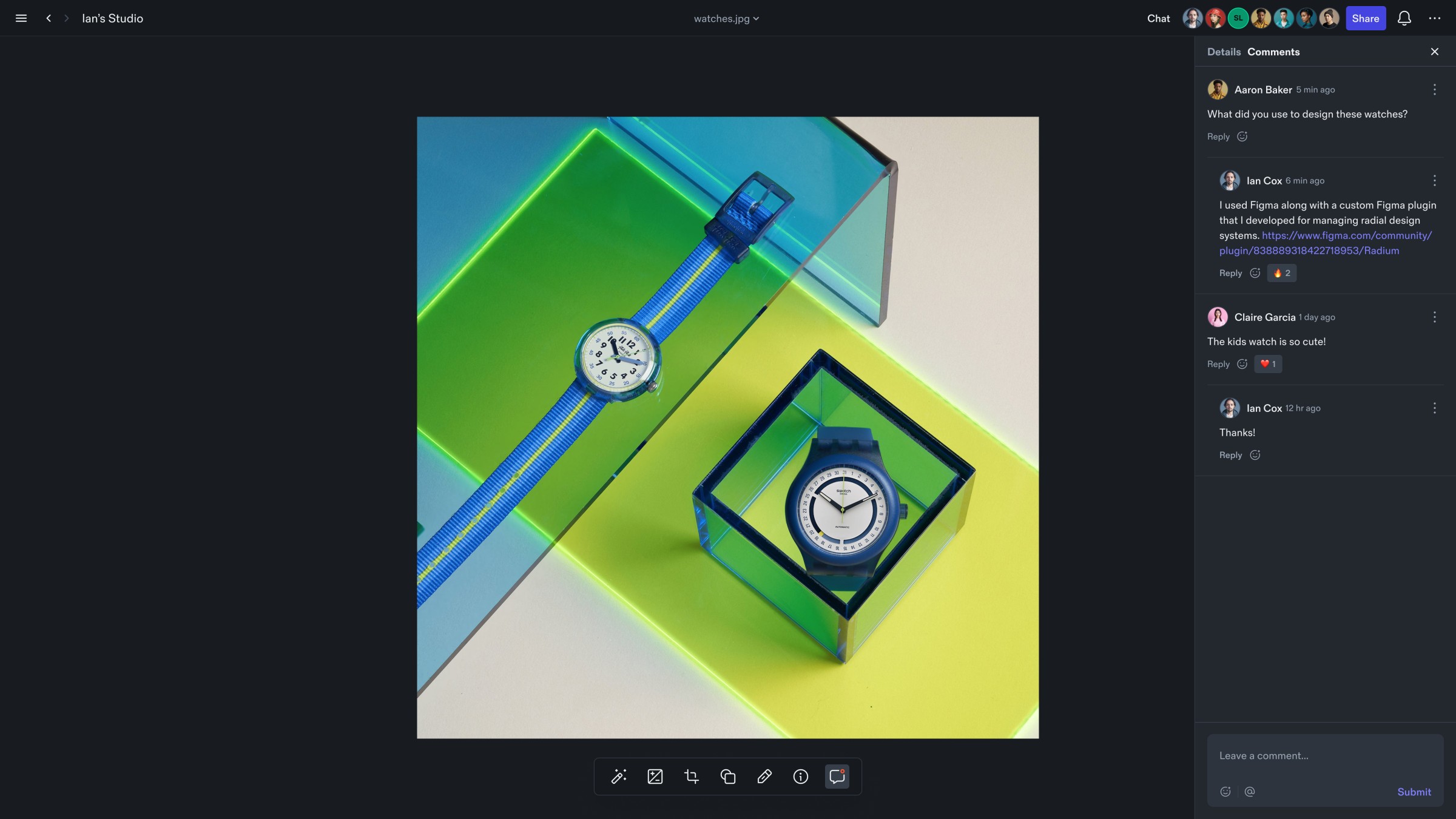
Full screen states for everything
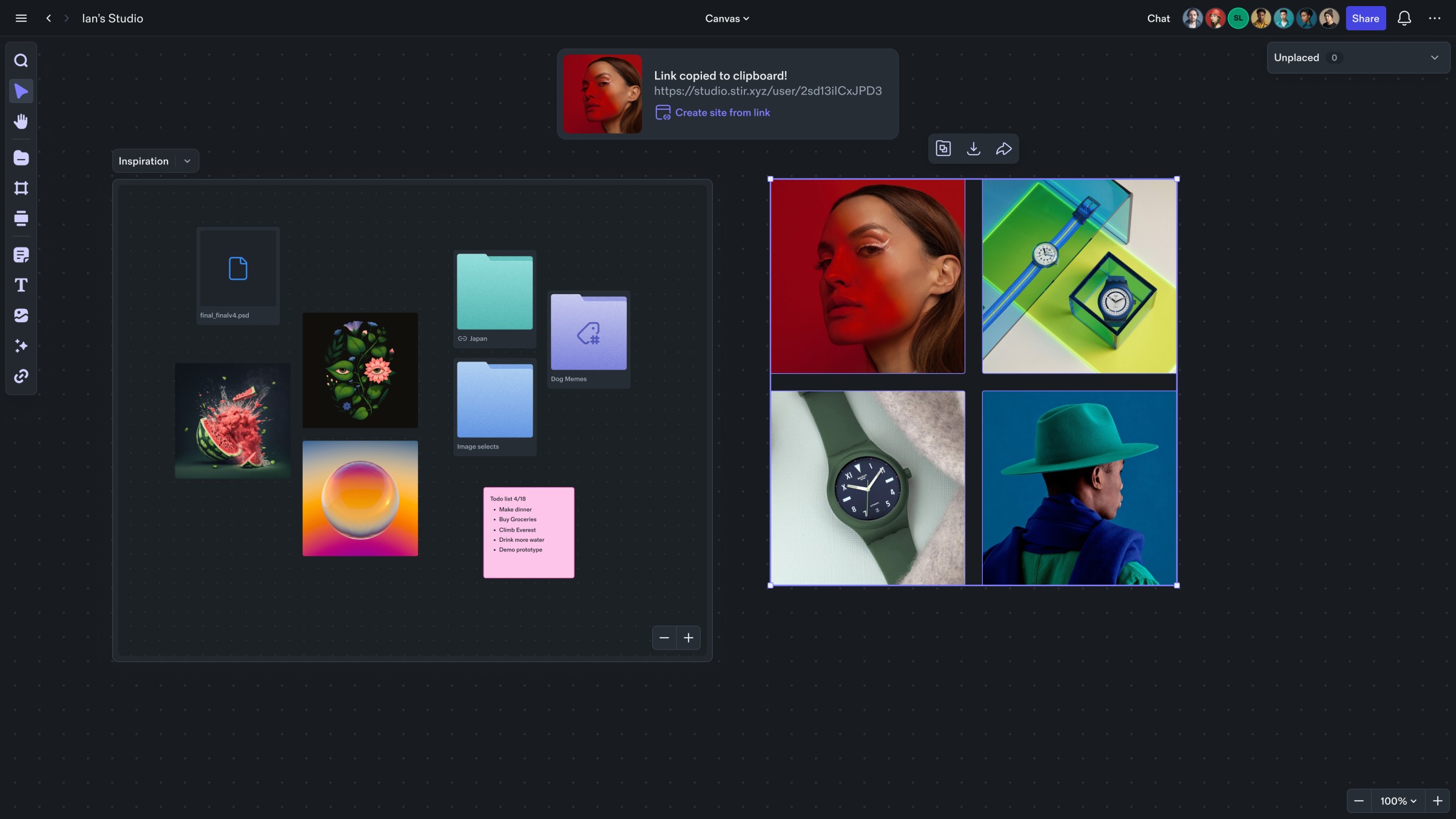
Nearly every object in Studio can be displayed as an Icon, inline on the canvas, or in full screen. When nested folders are opened full screen, you’ll see breadcrumbs indicating their path. When files are opened full screen you’ll see their file name at the top and any special editing or playback functionality related to the open content. Full screen views give each content type the ability to have custom UI without cluttering the canvas experience.
Document flows
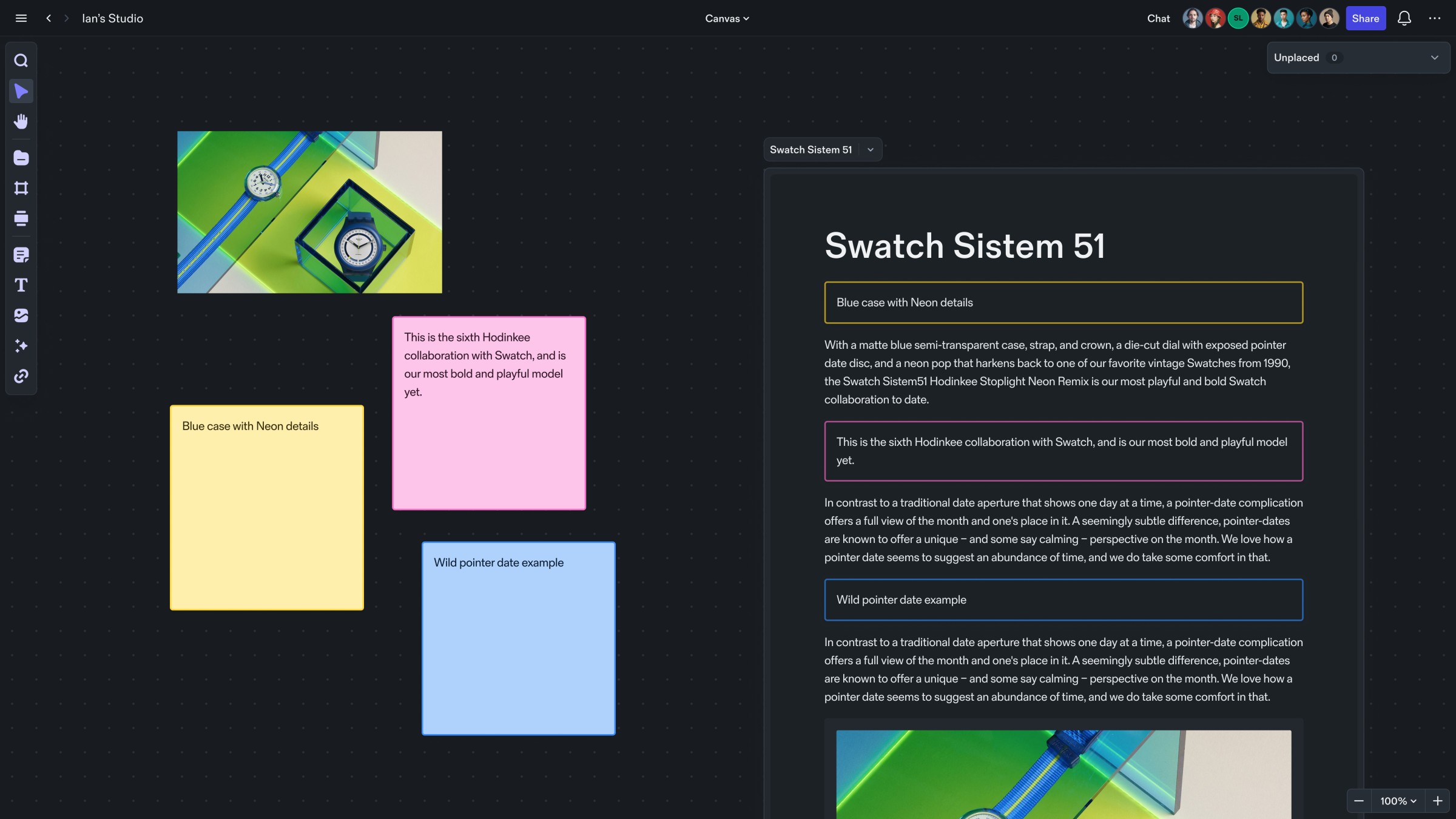
Document flows are unique objects in Studio as they behave like both files and folders at the same time. On the surface, a document flow looks like a normal text file but if we look a little closer, we see that it can contain any other file type which is then displayed as blocks in a defined order. This means that you can drag a sticky note, or image into a document flow and see it displayed as a block.
Design system for light and dark mode
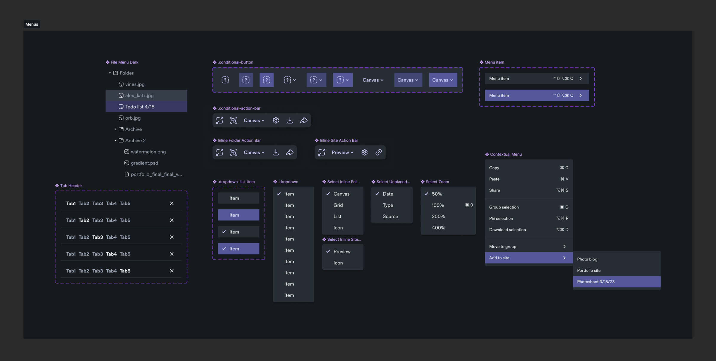
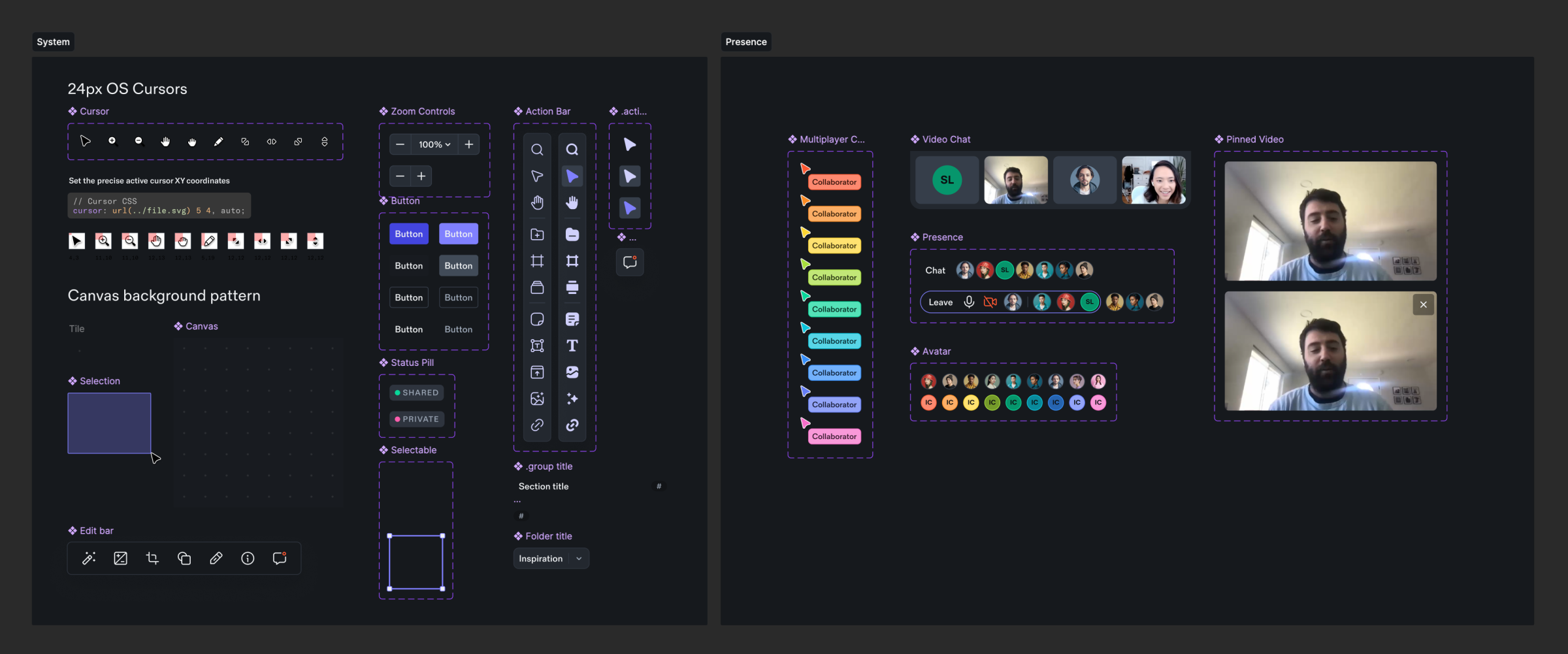
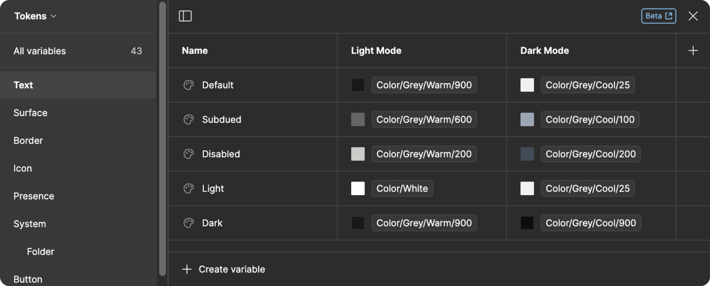
The Studio design system utilizes Figma's new variable funtionality in order to create components in both light and dark mode. All variables are tokenized with semantic names that reference a set of primitive values.
Themes
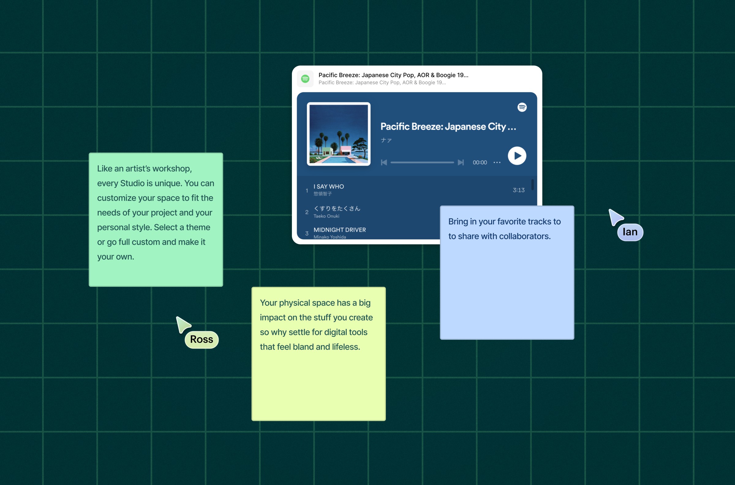
In addition to light and dark mode, Studio has been designed to utilize a number of custom themes that help make each studio space feel unique. Themes can be neutral or full of character giving creatives the ability to choose how their work feels on the canvas.
