
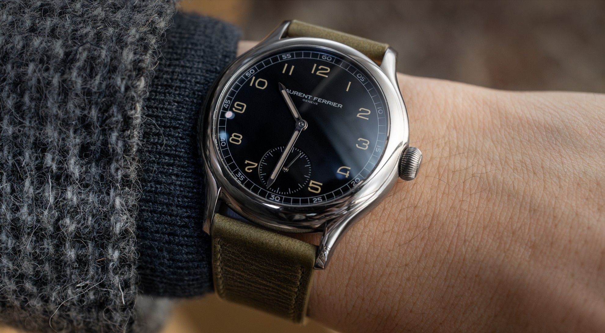
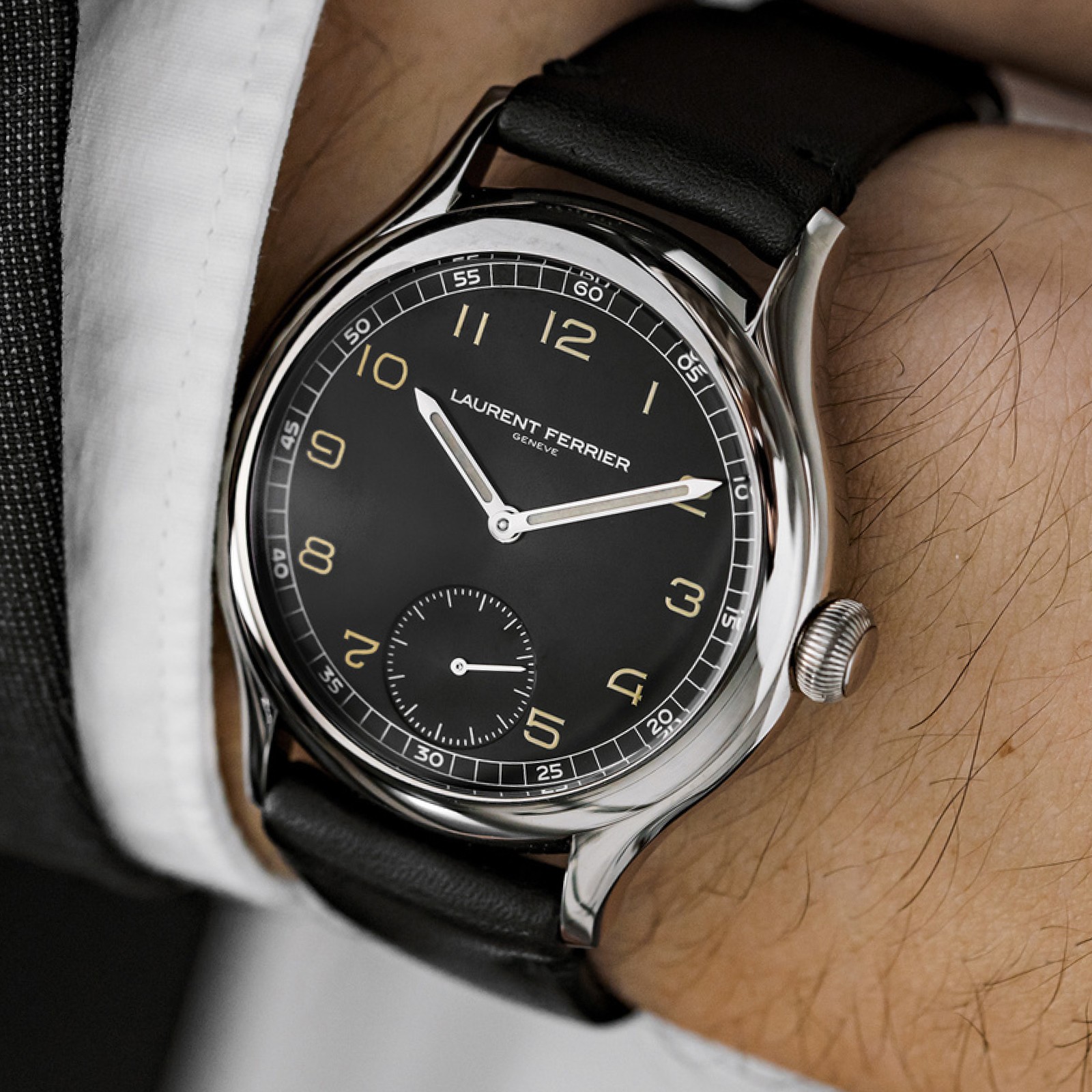
Focus on craft and details
In all of my design work, I care deeply about craft so I couldn't have been more excited by the opportunity to work with Hodinkee and Laurent Ferrier to design this limited edition wristwatch. After all, it's the thoughtful details that can really elevate a product. I took inspiration from a variety of vintage watches and created two sets of numerals specifically optimized for the exact sizes they would be used in on the dial. Many modern watch brands opt for off the shelf typography or worse (default system fonts) when designing even the most expensive luxury time pieces. The thought of using Arial on a fifty thousand dollar watch makes me shudder but is way more common than you would think.

A custom typeface and Figma plugin
I drew the two numeric typefaces by hand in Glyphs and completed the dial layout in Figma. Watch dials are often like miniture design systems and are frequently built from a set of shared components and styles. To take advantage of Figma's already robust component system and to assist in the creation of radial interfaces, I developed my own Figma plugin called Radium. Radium allowed me to build complex radial systems and make small adjustments quickly. After using the new system, designing watches in Illustrator felt horribly archaic and greatly deminished the speed at which I could iterate.


Optimizing the typeface for small sizes
The material of a watch dial can be a pretty unforgiving surface to print on, especially when rendering typography in small sizes. Ink tends to pool in places where lines intersect which is especially problematic for acute angles. Fortunately, since all of this is custom, we can create a design language the eliminates sharp angles and limits unnecissary intersections. These basic rules help shape the unique aesthetic found in watchmaking. The 4 and 7 which often have sharp angles have been re-constructed with 90º angles and the 6 and 9 don't fully connect reducing need for an intersection where ink could pool.
The two typefaces were drawn specifically for the sizes they would be printed at making use of small typographic features called ink traps and spurs. These small cuts and protrusions compensate for the way the ink pools when printing and helps to maintain sharp corners that would otherwise round out. The feature is very evident in the digital file but becomes more subtle when printed. On close inspection you can see remnants of this process which gives the watch added character.
