Challenge
Create a logo to reflect one of Google's new product offerings while maintaining close alignment with Google's master brand.
My Role
I lead the design and execution of a new logo for one of Google’s core product offerings. I collaborated with two other designers and worked closely with Google’s Brand Studio to craft a visual narrative representative of the product.
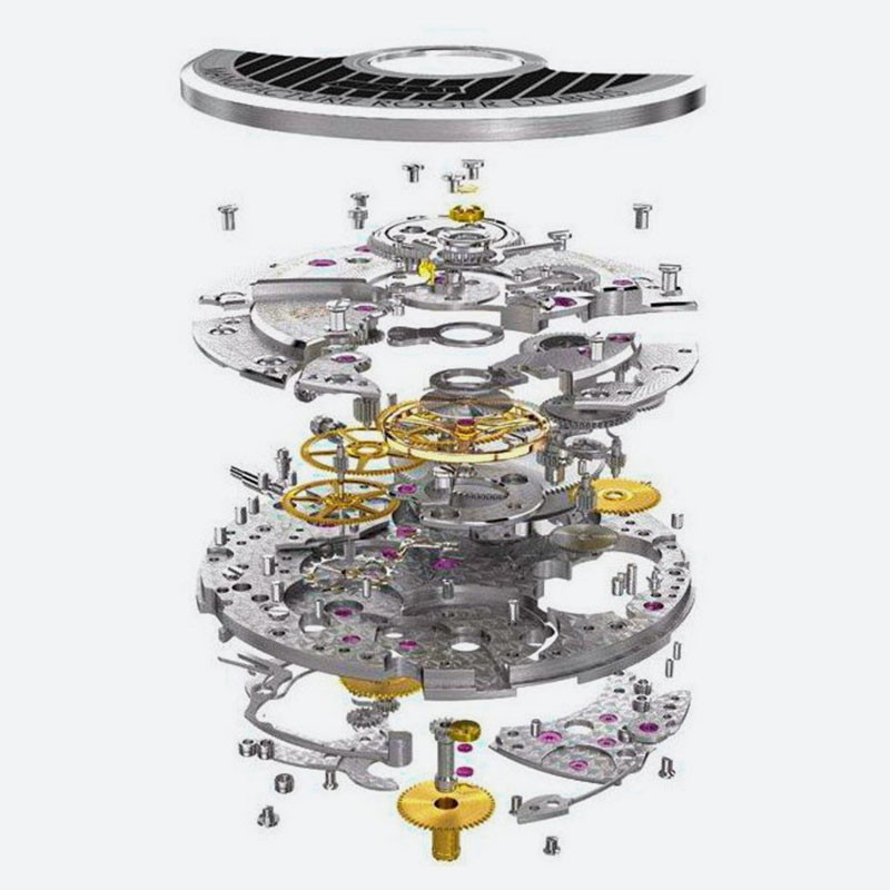
Concept 1 - The Mechanical Watch
With its precise mechanical complexity and simplistic user interface, the automatic wristwatch draws conceptual parallels to that of Google’s new suite of products. Under the hood, both are highly technical, representing a mastery of engineering and seamlessly bringing together an array of moving parts. Despite these internal complexities, the product itself remains intuitive and requires little to no knowledge of its inner workings.
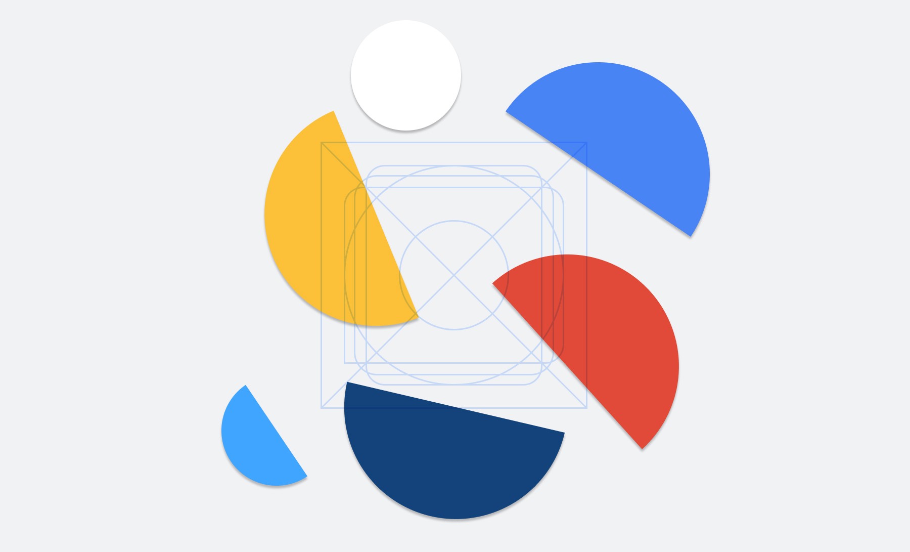
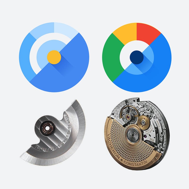
The rotor is an essential piece of the automatic watch. This half-circle piece of metal relies on gravity and wrist movement to power the watch. The half circle represents the power of a self-contained system and has been used as the primary building block in which the logo has been constructed.

The 45° rotations align with Google’s grid system and take reference from the Google “G” mark.
The formal characteristics of the logo mirror elements found in horology from its radial structure to the half circle rotor like components. Even the clockwise motion in which it animates is representative of time tracking devices.